Item Trend by Customer | NetSuite
A company wanted better transparency in NetSuite on sales trends for a particular item by any particular customer over a specified period. Here's how we did it.
- Date
- December 16, 2025
- Read
- 3 min

One of our clients wanted better transparency on sales trends for a particular item by any particular customer over a period of time, especially in a visual or graphed format.
The desired outcome can be achieved by a NetSuite saved search, which is then placed on the customer dashboard as a KPI or trend graph. Here are the steps to do so:
Create a Transaction Saved Search in NetSuite
Step 1: Set Criteria
- Type = Invoice
- Item = [target item]
- Main Line = False
- Tax Line = False
- Shipping Line = False
- COGS Line = False
- Make sure the search is public and available for dashboard view.

Step 2: Format Results Columns
- Name (Group)
- Quantity (Sum)
- Amount (Sum).
Step 3: Check the "Run Unrestricted" checkbox
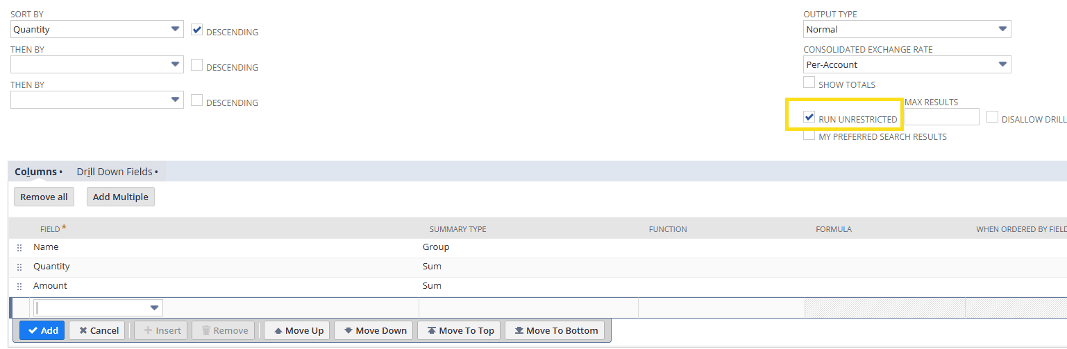
Step 4: Add a date filter.
Adding the Results as a Visualization in the NetSuite Dashboard
On the Customer Dashboard, add a trend graph with the saved search set as the trend type. Set the date period you desire to see (example is monthly).

Conclusion
It’s as simple as that. The saved search results page is also useful, as you can see which customer has purchased the highest quantity of the item. One downside regarding the use of the customer NetSuite dashboard, however, is that you cannot publish a customer dashboard without a paid add-on called Advanced Customer Dashboard, so the trend graph has to be manually placed on each customer dashboard you want to view it on, which can be a bit tedious.
Got stuck on a step in this article?
We like to update our blogs and articles to make sure they help resolve any troubleshooting difficulties you are having. Sometimes, there is a related feature to enable or a field to fill out that we miss during the instructions. If this article didn't resolve the issue, please use the chat and let us know so that we can update this article.
Oracle NetSuite Alliance Partner & Commerce Partner
If you have general questions about NetSuite or more specific questions about how our team can support your business, contact us. Anchor Group is a certified Oracle NetSuite Alliance Partner and Commerce Partner equipped to handle all kinds of NetSuite and SuiteCommerce projects, large or small.
Tagged with Training