Marketing Efficiently | NetSuite Analytics Workbooks
If your company uses NetSuite but has not yet engaged with the SuiteAnalytics Workbook tool, the time to start is now!
- Date
- January 13, 2026
- Read
- 15 min

If your company uses NetSuite but has not yet engaged with the SuiteAnalytics Workbook tool, the time to start is now! This new tool (beta 2018, recent update 2020) combines the power and repeatability of Saved Searches with the accessibility of Reports. For many NetSuite users, the Workbook tool could entirely replace both Saved Searches and Reports, with a number of added benefits.

Highlights of the Workbook Tool
- By separating the dataset and workbook that pulls data from that dataset, the Workbook tool allows for nearly instant manipulation of displayed search results without worries of changing the overall search criteria. By assigning multiple child workbooks to a single parent dataset, it is now easy to access and store several distinct sets of results from a single set of search criteria.
- Much like reports, workbook pages easily integrate into a user or role’s dashboard, for an at-a-glance view of key data.
- Visualization is a key strength of workbooks, with easy-to-change chart labels, scales, and colors. Workbook pages are easy to export for putting in PowerPoint or on a webpage.
- Workbooks (and their parent datasets) are intuitive to set-up, with click-and drag native functionality. It is much easier to access drill-down fields in a workbook than in a saved search, particularly if you aren’t already familiar with the hierarchical structure of the record type you are dealing with.
Furthermore, within an individual workbook, you can build multiple tables, pivot charts, and bar charts. This helps you focus on whatever data you are interested in at the moment, without (1) being distracted by all the other data or (2) being more than a click away from that other data, should you want it. Workbooks present a brilliant synthesis of fine-grained and big-picture analytics, enabling you to zoom in or out as needed.
To illustrate some of the powerful functionality of the SuiteAnalytics Workbook tool, I’ll walk you through setting up a custom dataset and workbook. This example dataset and workbook will be used to help analyze the absolute and relative efficacy of our company’s marketing campaigns.
Accessing Analytics Tool
Before we can create any datasets or workbooks, we must have the Analytics tool enabled. Enabled is the default setting for most accounts, but if you can’t find the tabs below, you may need to enable the feature. To do this, an administrator should go to Setup > Company > Enable Features.
Choosing a Dataset (or creating a new one)
In the header bar, select Analytics. This will take you to a page with two tabs: Workbooks and Datasets. We’ll start with datasets, as every workbook must have a dataset as its parent so it can have stuff to work with and display.
You will see that there are already several datasets listed, as NetSuite comes with these ready-made. These default datasets deal with customers, inventory, sales, time tracking, webstore orders, transactions, and more. Default datasets will always list “system” as the owner. You can’t change the default datasets directly, but you can save a copy of a default dataset and make changes to that.
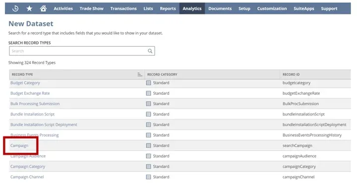
For our purposes, though, and to illustrate that it is quite easy to make your own, we will click the “New Dataset” button on the right of the screen. This will take you to a list of record types. Workbooks, just like Saved Searches, are each associated with a single record type. By using drill-down fields and associated records, you won’t be restricted to only data in the record type you select, but this record will be the source of most of your data. For more on the best order in which to link record types in workbooks, see this video. Today we are interested in marketing, so we are going to scroll down and select “Campaign,” which is NetSuite’s core record for marketing.
Selecting result data
Now you will see a three-panel page something like this:
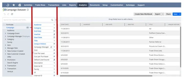
This is where you set up your dataset. The left panel contains groups of records and fields that all belong to the campaign record type. The middle panel contains fields and drill-down records within each of those groups. What is displayed here will change based on which group you click in the left panel. The big panel on the right contains all the data that will belong to the dataset. You bring data into the dataset by (1) double clicking the field in the second panel or (2) dragging and dropping the field into the third panel. It is a good idea to bring all of the data that you think you might possibly need into this panel on the right, as you might find you want access to it later when putting together workbook pages, and having a lot of data won’t clog up your data analysis much because you will only be picking a few fields for each workbook page. (It doesn’t have to be perfect the first time, though, as you can edit or add a field to the dataset later.) You can even change the order in which the data from these fields is displayed in the right panel by dragging the column headers around, but I wouldn’t worry about this in the dataset, as the workbook is where we will figure out all the visuals and the order of presentation.
For our dataset today, make sure you have dragged in these fields:
- Campaign manager
- Cost per Lead
- Title
- Leads Generated
- Return on Investment
- Total Cost
- Family
- Campaign Manager Employee > Labor Cost (see how easy it is to get to a drill-down field?)
To remove a field you don’t want, find that column in the right panel, click the three little dots icon (which is called a Kebab menu, in case you were curious), and click “Remove Column.” Be careful when adding fields like “name” or “title,” as you want to make sure that you are pulling the name of the record you want, not the name of a child record you aren’t interested in.
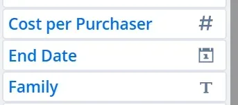
Notice that each field has a convenient icon next to it telling you want sort of value field it is. For instance, Cost per Purchaser is a numeric value, End Date is a calendar date, and Family is a text field. If you click on that icon, more information, such as the field ID (super useful for scripting) will appear.
Notice also how convenient the search bar is above the two left panels. This is one of the areas where the Workbook tool distinguishes itself as much easier to navigate than save searches and reports.
Criteria
Above the big right panel is a horizontal slot for entering criteria. This is where the Worksheet tool captures most of the search criteria functionality of a saved search. Just as in saved searches, you can restrict date ranges, set conditions, and use formulas. Given the long-term usability of a dataset like the one we are building, though, I wouldn’t recommend restricting the date range at this stage, unless if you select an option such as “in the last rolling year.”
You can certainly add your criteria before dragging fields into the big right data panel, but I often find it easier to first put all the data there and then thin it out via the criteria, so that is what we are going to do today.
Let’s say that we are only interested in analyzing tradeshow marketing campaigns, not email campaigns or ad campaigns, so we’ll restrict the dataset to only include campaign records of the campaign category “tradeshow.” (Tradeshow is a campaign category I created; you can create your own categories in Setup > Marketing > Categories > New. To see these options will require you to first have the marketing features enabled by your administrator: Setup > Company > Enable Features.)
To use campaign category as a criterion, we will first need to make sure that Category is not already in our right panel, as you can’t use the same field for both criteria and the results.
Drag the Category field into the Criteria slot. You will see two bins. Highlight whichever categories in the left bin you want to show up in your dataset, then hit the middle arrow, which will push those categories into the right bin. (The default is for this to work as an “If… then” condition, but you can also change it to an “If not… then” condition by changing the “any of” option to “none of.”) Then hit “apply.”

Visualizing search criteria and adding operators
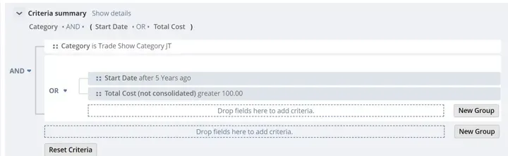
When you add multiple search criteria is when you start to see another advantage of the workbook dataset over saved searches: visualized logic. To see this in action, let’s click the “New Group” button.
Drag “Start Date” into this second group you just created. Let’s say we are only interested in campaigns begun within the last five years, so in the Relative Dates tab, select “after,” type “5,” and select “years ago.”
Now drag “Total Cost” into this second group. Since I’m more interested in evaluating the efficacy of costly campaigns than worrying about cheap campaigns, I set Total cost to be “greater than 100.”
Here is where it gets crazy, so hold onto your hat. Keep the operator between the two groups as AND, but change the operator within the second group to OR. Now, we’ll only get results from campaigns with the tradeshow category, and only when they are either started within the last five years or cost more than 100. This would still return a $5,000 campaign from 7 years ago, as long as it was in the tradeshow category. The tree method used here by the workbooks dataset makes it easy to visualize and quickly move around conditions and conditional operators.
Saving your dataset
Once you like your dataset, click the “save” button on the right and rename the dataset.
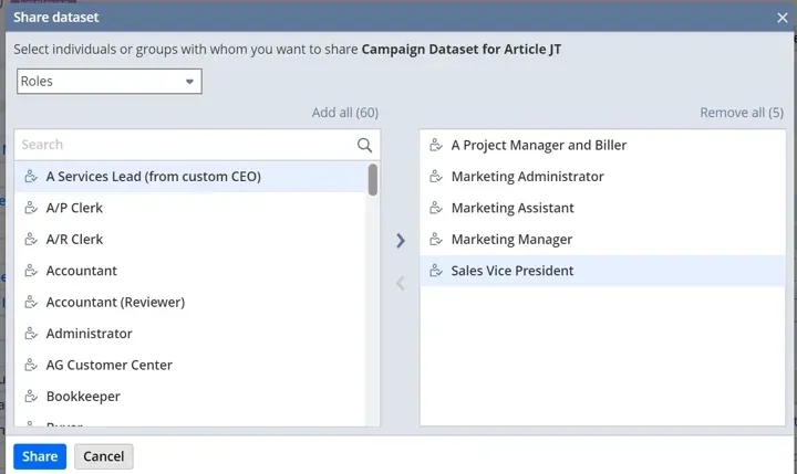
Sharing your dataset
This is a remarkably simple timesaver that keeps your teammates from having to redo work you’ve already done: Once your dataset is saved, you can easily share it with whomever in your company would find the data useful. Just hit the “Share” button on the right, push any roles or individual employees you want to share the dataset with into the right bin, and hit “share.” They can then create their own personal workbooks based on the same raw dataset. Slick.
Creating a workbook
This is as simple as hitting the “Create a new workbook” button on the right.
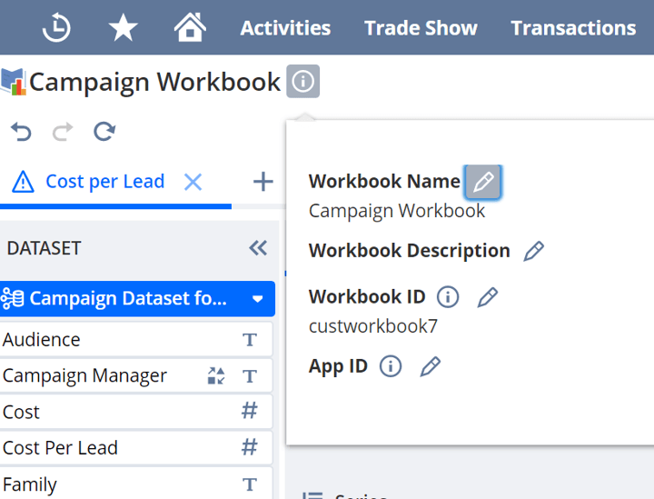
Begin by setting the workbook name. On the upper left you will see the current workbook title (Campaign Workbook). Click on the information icon to its right to access the workbook properties; rename as desired. (Note: if you want to change the ID, just like for most of NetSuite, you should begin your ID name with an underscore, so it is separated from the prefix NetSuite adds.)
Setting up a workbook page
Select the visualization type you want for your first page, and you’ll soon be ready to start analyzing data! Let’s pick the “Chart” type for this first page.
Today we want to evaluate the average cost per lead generated by each tradeshow. It is helpful for organization to rename the page right away: to do that, double click the “Chart 1” tab name on the upper left.
You will now see three panels: DATASET, LAYOUT/PROPERTIES, and the chart panel. In the DATASET panel live all the fields that you selected when creating your dataset. If you ever want to change these fields, you can quickly edit the dataset right from the workbook by clicking your dataset name.
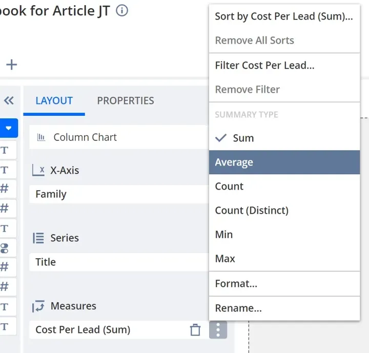
Drag Family into the X-Axis, Title into the Series, and Cost Per Lead into the Measures. Change Cost Per Lead to display Average rather than Sum.
Refreshing workbook
We are almost there! But why won’t our chart display? Anytime you make a change in the workbook, if you want those changes to take effect you have to hit the refresh button at the top left of your screen (note: this is not the same as the “save” button on the right). If you have unsaved changes, any of the tabs that are affected by those changes will display a triangle warning icon to let you know you need to refresh.
Renaming chart
To improve the accessibility of your chart, go to the PROPERTIES tab in the middle panel.
I set my labels as follows:
Title: Average Cost per Lead
Subtitle: Total cost / # Leads
X Axis: Trade shows over the years
Y Axis: Cost in $
Don’t forget to refresh your workbook.
Reading chart
Now you have a fancy-dancy visualization! You can imagine using this chart as-is in a briefing or pitch meeting, or to help make a resource-allocation decision.
Because we used the Series functionality, the X axis shows tradeshow campaigns (the Campaign Title field) grouped by family. I have my marketing campaigns organized such that each tradeshow (e.g. Trade Show Vegas) is a family, while each year’s individual instance (e.g. Trade Show Vegas 2019) is its own campaign associated with that family.
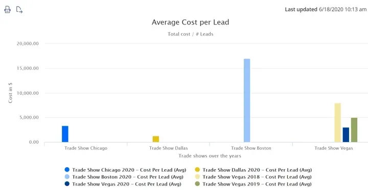
In our example, clearly the Boston trade show looks inefficient, with an average cost per lead twice that of any of the other tradeshows. We would have to dive deeper (possibly by means of changing search criteria in our dataset) to make sure that the high cost per lead isn’t explained by some other factor (perhaps the Boston trade show hasn’t happened yet, etc.), but it looks like our marketing resources should be reallocated.
Suppose we want a little more information when we are looking at this chart, but we don’t want to mess up the simple visual. For instance, perhaps I don’t only want to see the average cost per lead; I also want to know how many leads were generated at that trade show. Simply drag the “Leads Generated” field into the Series, underneath “Title.” The columns should look the same as before, but the number of leads will be found in the key underneath the chart. You can also see that data quickly by hovering your cursor over the column of interest.

Adding workbook pages
Just as each dataset can have multiple workbooks, each workbook can have multiple pages. Just hit the + sign next to your current tab and a new page opens up!
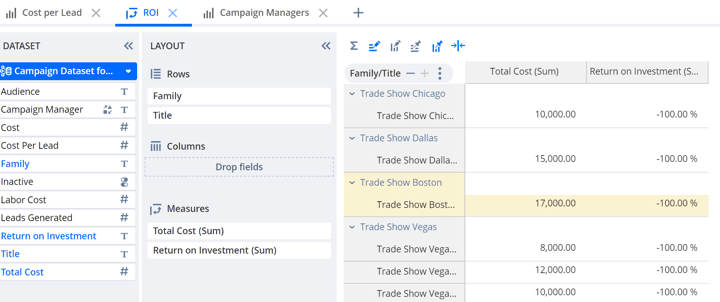
Here I’ve included two more pages to illustrate a few of the other forms of visualization that workbooks offer. The first is a pivot chart, which I’ve used to judge the cost and return on investment of each marketing campaign, grouped by family.
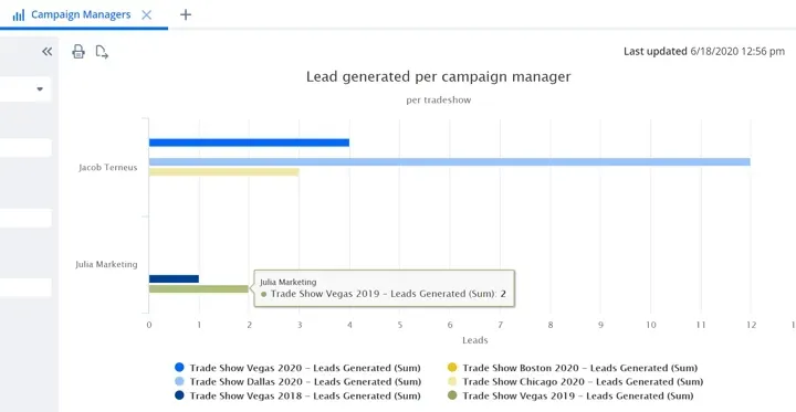
The second is a bar chart. Here it is used to analyze the efficacy (in leads generated) of each campaign, sorted by campaign manager.
Just like datasets, workbooks are quickly shareable to particular roles or employees. They can also be easily exported to an SDF XML file (dataset definition or workbook) or CSV file (dataset data). The Save-As functionality for datasets and workbooks is a further plus, as it enables you to efficiently reuse work you’ve already completed.
Conclusion
As you can see, the Workbooks tool is easy, fast, and powerful. In our examples, we’ve only dealt with a few of its capabilities, but its potential uses are much broader than merely analyzing marketing campaigns, for workbooks can be used to analyze all of NetSuite’s record types. We also haven’t discussed how to integrate Workbook visualizations into user dashboards for consistent, up-to-date, and easily-available access to the important data analysis you need to keep your business running at its peak performance.
To learn more about these possibilities, or for more info on SuiteAnalytics and how you can leverage NetSuite to better serve your needs, reach out to us at Anchor Group NetSuite Consultants and Developers.
Hopefully, this post gives you something to work with while trying to understand NetSuite and what it can do for your business. If you have any questions and want some free consulting advice, feel free to easily available our team at Anchor Group.
Related Articles