Using SuiteCommerce Landing Pages to Drive Ecommerce Success
There's more to a good ecommerce website than well-crafted PLP and PDP pages. You will also need to make use of landing pages to build trust with customers and communicate key information about your business.
- Date
- December 22, 2025
- Read
- 11 min

There's more to a good ecommerce website than well-crafted PLP and PDP pages. You will also need to make use of landing pages to communicate key information about your business, such as who you are, and what you do. Communicating this kind of information well helps you inform and build trust with potential customers in the early stages of their purchase journey. Let's start by looking at the homepage since it is your first opportunity to grab your customers’ attention and pull them into that journey. They have already taken one initial step and showed interest by coming to your homepage; this is where you need to show them that they came to the right place.
Optimizing Your SuiteCommerce Homepage
SuiteCommerce makes it easy to have a modern, sleek homepage. It is highly customizable and configurable. You can display carousel images, special deals, products you would like to feature (or get rid of), testimony quotes from customers, or item categories you would like to highlight. The amount of time a customer spends on the homepage is relatively short, so it should be primarily a visual experience rather than a textual one. Here is where you use your highest-quality, most striking pictures. Check out the beautiful images on the homepage of Daily Harvest – enticing, no?
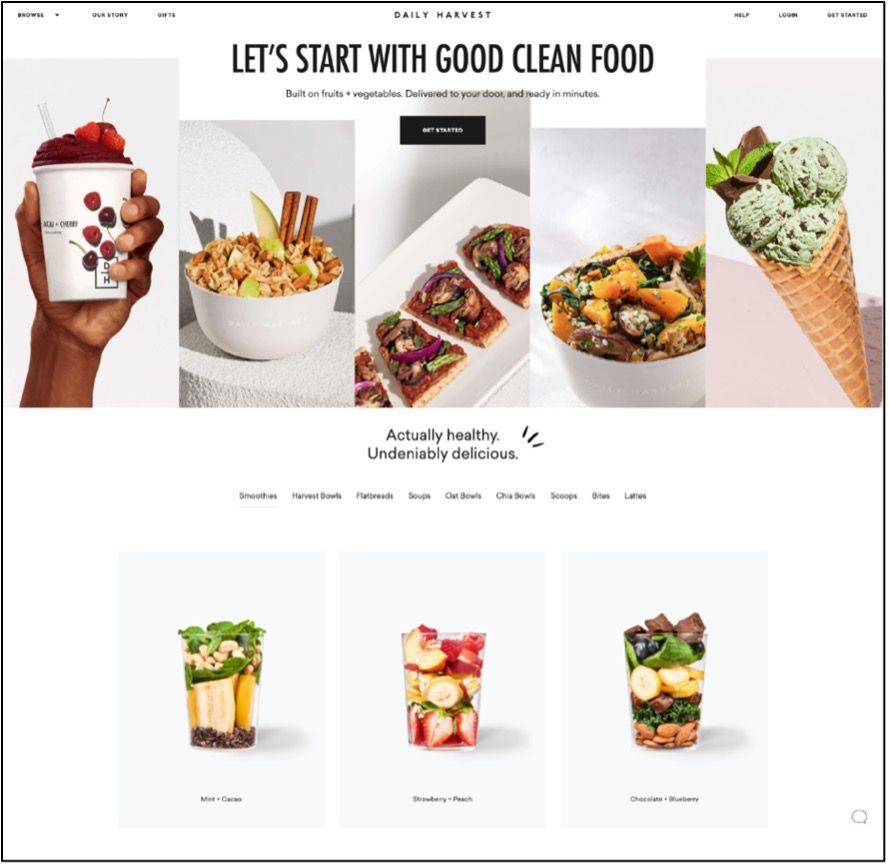
It is not enough to just have images of what you are selling, or just slick, pretty images; you need slick, pretty images of what you are selling. Far too many websites either have just one or the other.
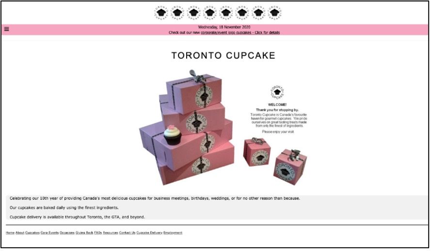
Compare the images on the Daily Harvest homepage with the image on this website for Toronto Cupcake. First of all, the picture here is dark and at a funny angle. A professional food photographer could help with that. Second, and more importantly, the image makes it seem like this store primarily sells boxes, rather than cupcakes. What do you think makes a potential customer’s mouth water more: paper boxes or luscious cupcakes?
Here is another example of failing to inform your visitor:

This homepage, for Diller Scofidio + Renfro, gives you very little information about the company or what the website sells. This is undoubtably a slick, professional image, but it is empty of content. As far as the homepage goes, this could be a website about nearly anything, which means that – from a visitor’s point of view – it is a website about nothing. Only if the visitor clicks through the index will he eventually discover that this is a website for a large urban design studio, and then the home image will make more sense to him. But does the homepage motivate a visitor to keep clicking? Don’t get me wrong: the Diller Scofidio + Renfro website is artsy and unique; clearly, someone put quite a bit of effort into designing it. Now you get to decide what is more important for your business: an unusual website or the most effective source of ecommerce revenue?
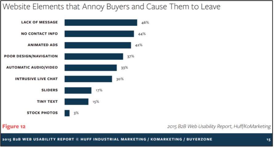
Homepage images need to inform as well as entice: inform insofar as they confirm to the customer that your website is the right one, and entice insofar as they make your products or services attractive. Having a “lack of message,” that is, not informing customers what you actually sell, is the primary cause of customer annoyance on ecommerce websites:
Bonus Content: Check out the SuiteCommerce Homepage QA Checklist!
Good SuiteCommerce Homepage Examples
What does a clear, simple message look like? Here are two example homepages:
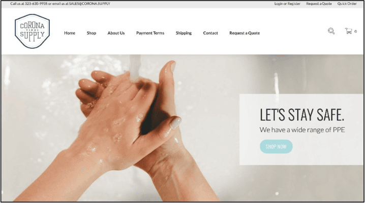
This Corona Supply page gives you two simple messages: First, this is a safety resource. Second, the way it helps you stay safe is through providing personal protection equipment. No ambiguity there. The image of handwashing is clean and clearly related to protecting people from germs. Plus, the picture is taken from the perspective of the hand-washer, so this is a familiar view to any site visitor who washes his hands. That familiarity and first-person perspective serves to draw you in. It says “Our products are not just for other people, they are for you.”
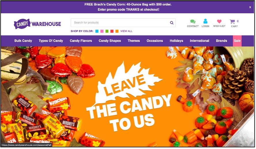
The message of this Candy Warehouse homepage is also simple: Come here for all of your candy needs (desires?). There is also a fun pun in the word “Leave,” but it isn’t necessary to get the pun to understand that this website sells candy.
Building Trust: Make Your Legitimacy Tangible
An astronomically important element of the homepage that is often neglected is the Contact Information. In a 2015 marketing survey, it came out that most people want to see contact information, as well as about/company information, easily accessible right on a home page.
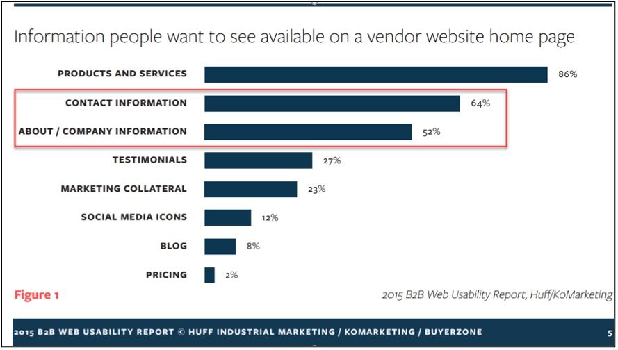
Remarkably, relatively few respondents to this survey indicated they wanted to see a Blog, Marketing Collateral, or Social Media Icons made available from the home page. (Figure 1) The data shows that vendors need to establish trust and credibility with buyers as soon as they arrive at the website. Information needs to be up-front, visible, and easily accessed. It also needs to be current and explain what the vendor offers in jargon-free language.
The homepage, in other words, is about building trust. Really, it is about building two kinds of trust: trust that you are a real business with real people and a real address, and trust that you offer the precise product or service in which the customer is actually interested.
Building the first kind of trust, trust in you, starts with something as simple as a good contact section on your homepage. See our contact section in the footer as an example.
A robust section of team biographies can also help with the first kind of trust. There does not need to be a bio for every temporary intern on your team, just for a few of the big players, and especially for anyone that a potential customer would be likely to have an interaction with, like sales reps and project managers. You can check out our About Page for a good example of a bio section featuring key players.
Building Trust: Clarity in Communication
Building the second kind of trust will require a careful rewriting of your “about” section. Tell it to your customers straight, and avoid the meaningless long words often used in the business world today; You know the jargon I am talking about; it’s ubiquitous, even at some of the largest companies in the world:
Enron’s performance in 2000 was a success by any measure, as we continued to outdistance the competition and solidify our leadership in each of our major businesses. We have robust networks of strategic assets that we own or have contractual access to, which give us greater flexibility and speed to reliably deliver widespread logistical solutions. … we have metamorphosed from an asset-based pipeline and power generating company to a marketing and logistics company whose biggest assets are its well-established business approach and its innovative people. – Enron Annual Report, 2000
I don't know about you, but as someone who is quite familiar with jargon like this, I still have to read through that slowly to understand what they're really saying. How about this part for example: “a marketing and logistics company whose biggest assets are its well-established business approach and its innovative people.” It sounds nice, but what real information or value was communicated in that sentence? After all, a "well-established business approach" could mean any number of things. They also seem to be implying that Enron’s employees are more innovative than employees at other companies... but that's probably false. Hindsight is 20/20, so given that Enron declared bankruptcy less than a year later, it's easy to use their 2000 annual report as an example of misleading jargon. But, I don’t intend to single Enron out as being the worst offender; the same boring corporate lies are found in thousands of other annual reports and company websites.
The fact is, nobody wants to read this stuff. So who writes it? Answer: nearly everybody in the business world. If you truly want to set yourself apart as exceptional, writing clearly is one of the best ways to do so.
Writing High-Quality About Page Content
At any rate, the About section of an ecommerce site, whether it is on your homepage or a separate page that can be easily navigated to from your homepage, is not a good place to obscure what you do behind a cloud of fluff. Why on earth would you want to confuse your customers? Confused customers leave and never return! This is especially true of ecommerce websites, where you don’t have the captive, pressured customers that brick and mortar businesses like car dealerships can sometimes have.
Rather, the “about” section should be the place to clarify and disambiguate “what you do” for your customers. Now is the time to overcome the fear many people in business have of speaking in straightforward, concrete language. Concrete language, it turns out, is directly correlated with customer trust, which is directly correlated with concrete sales and concrete profits!
Instead of this...
“Following our historical trends, we leverage market forces and multi-entity purchasing strategies to overcome telecommunications overages and fortify partners with below-market-rate services in the telecommunications sphere, all while leveraging the technological advances of recent years.”
Write this...
“Want cheap, fast cell phone service? Talk to us! We’ve been providing inexpensive, re-bundled cell service from the most reliable providers since 2005.”
If you have been successful in building the two kinds of trust, and therefore in retaining your customers, then eventually the customer will move from the homepage to another part of your website.
The Value of Informative Content
It is worth noting that, just because a customer leaves your website doesn’t necessarily mean that he or she is not going to come back.
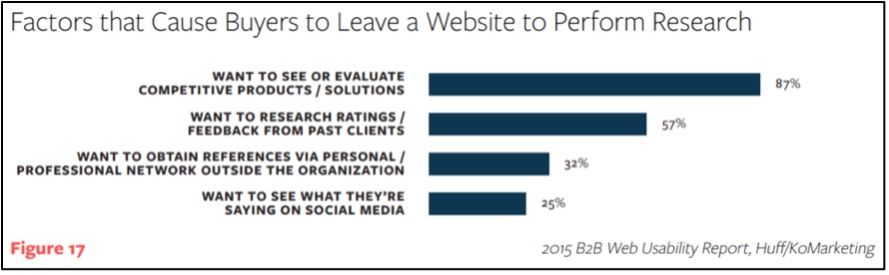
By far the most common research-based reason to leave (that is, the customer is leaving planning on possibly coming back, rather than out of annoyance or distrust) is in order to evaluate the competition. If you can provide that comparison shopping experience right on your own website, then you should be able to keep some of those researcher-type customers on your site. For instance, you could display easy-to-read charts or comparison checklists that place your product or service in parallel with those of your competitors. Allan Dib puts this well:
You must stop selling and start educating, consulting and advising prospects about the benefits your products and services deliver compared to each and every competitor in your category. - The 1-Page Marketing Plan, p. 138
You know that some of your customers will be doing research anyway; why not establish trust by telling them what they are going to find out anyway, and thereby giving them a reason to just stay on your site?
Related Article:
- 5 Ways to Utilize SuiteCommerce More Effectively
- Customize SuiteCommerce Default Messages Without Extension
NetSuite Commerce Partner
That's all for now, but we hope this article was helpful and informative! If you have questions about SuiteCommerce landing pages in general or about optimizing your website content in particular, feel free to contact our team at any time. Anchor Group is a certified Oracle NetSuite Commerce Partner, and is equipped to handle all kinds of SuiteCommerce projects, large or small!
We are a premium SuiteCommerce agency that creates powerful customer portals. Unlike our competitors, we have already solved your problems.
FREE SuiteCommerce Book
If you liked this article, you'll LOVE our book on SuiteCommerce! How do we know? Because the content in this article was reproduced from a section of our book! So, what are you waiting for?
Order the free SuiteCommerce book today, and we'll even pay for shipping!
Tagged with Training